
Styles
#0030
Abstract landscapes in watercolor washes style reference and prompts
Explore the “Abstract landscapes in watercolor washes” reference with tactile surfaces and cool blue-gray tones. View the images, copy the style or example prompt, and discover related styles on Looksift.
Compare the Qwen Image 2.1 and GPT Image 2.5 examples, choose the visual qualities you want, and copy the style prompt for your own project.
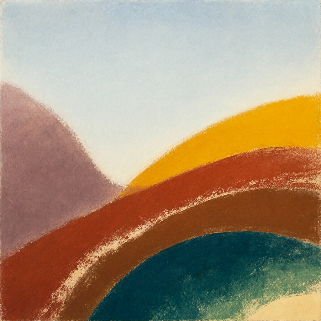 Qwen Image 2.1
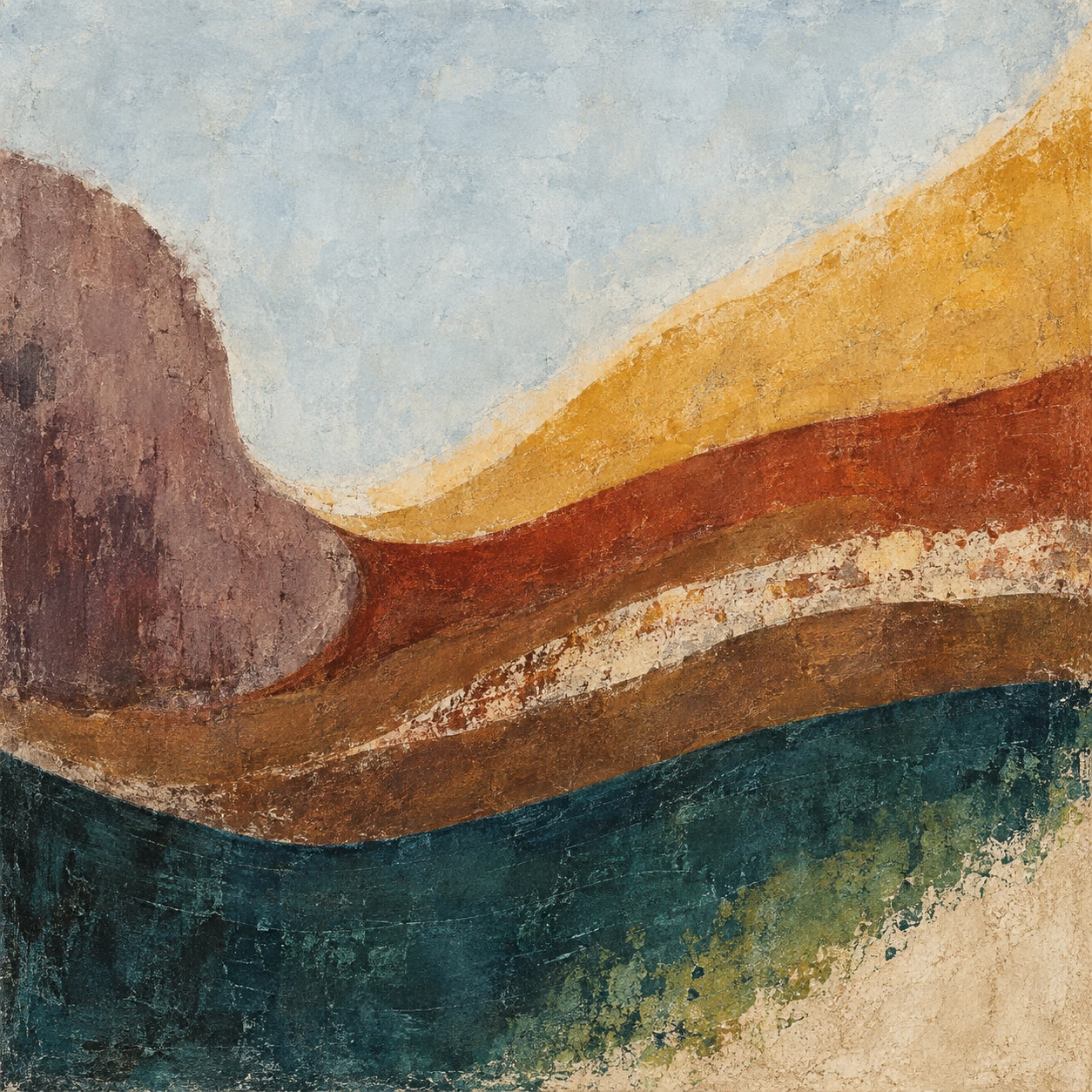 GPT Image 2.5
Reference details
- Reference ID
- 0030
- Category
- Painting
Reference prompts
Style prompt
The painting is organized by broad curved bands against a quiet pale field. Diluted washes and opaque brushed pigment meet along feathered, scraped, and granular edges, so each layer feels materially distinct. A large cool gray area gives room to smaller golden, russet, mauve, and deep teal masses; the darkest band settles low and adds visual weight. Color changes follow sweeping arcs rather than hard geometry, with occasional narrow light seams exposing the underlying surface. Illumination is diffuse and internal to the color relationships, without a depicted source or hard shadow. The overall effect is spacious, tactile, and gently dynamic, as if slow movement has been held in pigment.Full example prompt
A square abstract painting presents a broad pale field above a sequence of curving, textured color bands. The upper half is mostly soft blue-gray, quiet and nearly empty, with subtle mottling that resembles a thin wash on paper. Along the left edge, a mauve-brown mass rises like a rounded bank, its outer edge softly feathered into the light ground. From the upper right, a wide golden yellow band slopes inward and descends toward the center, leaving a narrow cream transition between itself and the open field. Beneath it, rust red and warm brown curves sweep from right to left and bend around the mauve form. A ragged light strip cuts through the warm middle bands, exposing rubbed, granular marks that suggest pigment dragged across a rough surface. The lower third is anchored by a dark teal arc, denser and more heavily textured than the luminous upper colors. Near the bottom right, the teal thins into green flecks and gives way to a small sandy cream corner. These layers never close into representational objects; their visual force comes from changing width, curvature, and contact at the edges. Light appears as an even radiance within the pale ground and yellow band, while the deeper red and teal layers provide shadowlike weight without a depicted lamp or sun. The surface alternates between diluted wash, opaque brushed passages, and grainy abrasion, making the transitions feel worked rather than digitally smooth. The overall composition balances large open space against a rising and falling ribbon of earthy color, creating a quiet but dynamic landscape-like rhythm.