
Styles
#0386
Roger Fry style reference and prompts
Explore the “Roger Fry” reference with cool blue-gray tones and pale neutral tones. View the images, copy the style or example prompt, and discover related styles on Looksift.
Compare the Qwen Image 2.1 and GPT Image 2.5 examples, choose the visual qualities you want, and copy the style prompt for your own project.
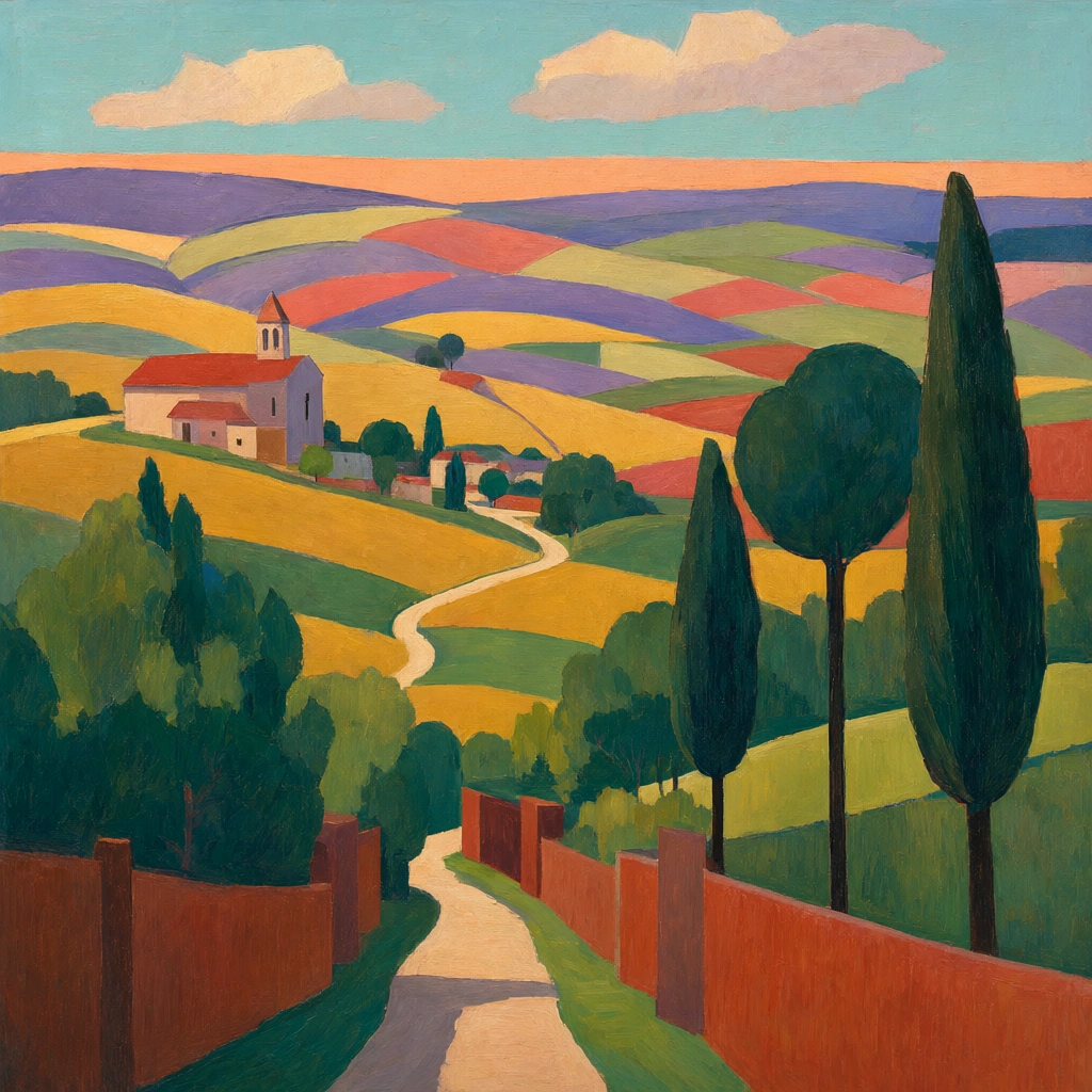 Qwen Image 2.1
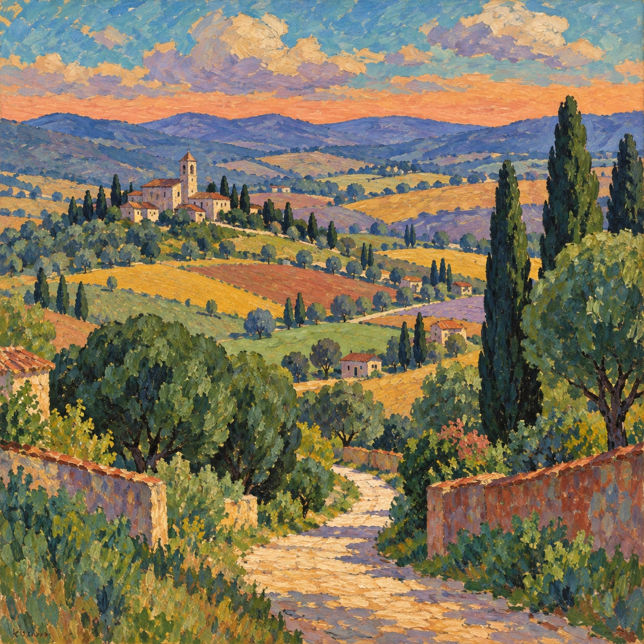 GPT Image 2.5
Reference details
- Reference ID
- 0386
- Category
- Painting
Reference prompts
Style prompt
A Post-Impressionist oil treatment partitions a wide view into clearly bounded, interlocking color planes. Golden yellow, coral, red-brown, jade green, deep teal, violet, and blue-gray recur across broad curved bands and compact upright masses. A pale winding line enters from the lower center and threads through darker rounded clusters toward a smaller distant focal area. Shapes are simplified and deliberately patterned, but short visible brushstrokes and fine canvas grain keep their surfaces painterly. Edges are firm and slightly irregular rather than mechanically straight; shadows are colored in cool blue and purple. The upper strip combines turquoise with flattened cream-mauve cloudlike patches and a low warm band. Light is broad and late-day warm on exposed planes, cooler in recesses, without photographic glare. The composition balances decorative flatness with readable recession, using repeated hues and the narrowing route to guide the eye through a richly colored but ordered field.Full example prompt
A square Post-Impressionist oil landscape looks across a patchwork valley toward a small church and village on a distant hill. A pale winding path begins near the bottom center, passes between blocky dark-green trees and red-brown garden walls, then curves toward the middle distance. Tall narrow cypress-like forms and rounded tree crowns occupy the right foreground, each treated as a solid simplified color mass. The church sits left of center with a low red roof and a little bell tower, made from mauve, cream, and terracotta planes. Behind it, rolling farmland spreads in broad bands of gold, violet, coral, pale green, and blue-gray. These fields bend around the hills rather than following exact perspective, giving the landscape a deliberate patterned rhythm. The horizon lies high, with an orange-pink strip below a turquoise-blue sky. Soft cream and mauve clouds float across the upper portion in flattened, angular shapes. The brushwork is visible but orderly: short textured strokes create a slightly granular surface inside clearly bounded color areas. Trees have dark outlines and modeled green interiors, while fields are wider and smoother. The palette is heightened but balanced by repeated color echoes: a red roof answers reddish walls, gold fields answer sunlit path, and cool violet hills temper the bright greens. Light feels like late afternoon or early evening, warm across the open slopes and cooler under the trees; shadows are colored rather than black. There are no prominent figures, so the path and village become quiet points of orientation. The composition feels decorative yet spacious, arranging a real countryside into interlocking shapes without losing its inviting sense of distance.