
Styles
#1613
Facepaint style reference and prompts
Explore the “Facepaint” reference with tactile surfaces, asymmetric composition, and rich color tones. View the images, copy the style or example prompt, and discover related styles on Looksift.
Compare the Qwen Image 2.1 and GPT Image 2.5 examples, choose the visual qualities you want, and copy the style prompt for your own project.
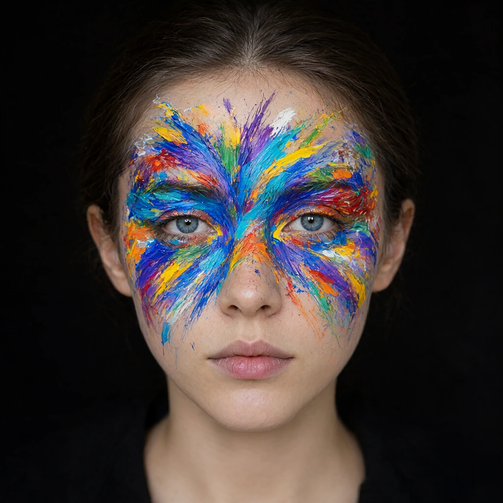 Qwen Image 2.1
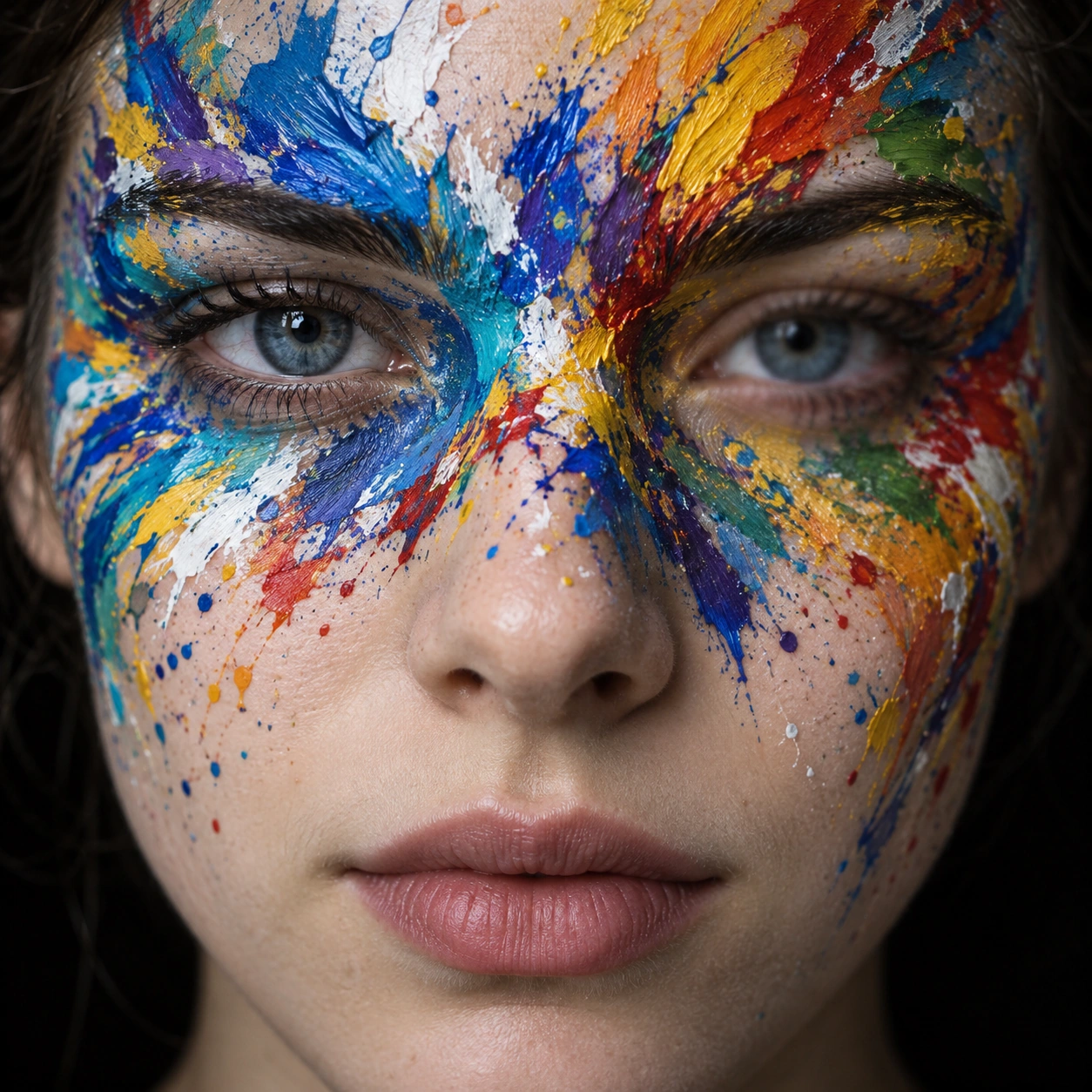 GPT Image 2.5
Reference details
- Reference ID
- 1613
- Category
- Photography
Reference prompts
Style prompt
The close photographic treatment places luminous, saturated pigment against a smooth pale surface and a deep near-black field. Cobalt, turquoise, violet, yellow, orange, red, green, and white keep their distinct chroma even where quick strokes overlap. Broad sweeping marks are interrupted by sharp flicks, scattered speckles, thin smears, and thicker raised deposits that catch pinpoint highlights. Soft frontal light preserves subtle middle tones beneath the color, while shallow depth of field makes the central marks and small details clear and lets the outer perimeter ease into softness. A broadly centered arrangement carries asymmetrical bursts that fan away from the middle, giving movement to an otherwise still composition. The finish is tactile and photographic, with visible pigment thickness, crisp local edges, and restrained retouching rather than uniform digital color. The contrast between calm dark negative space and explosive color is the principal visual rhythm.Full example prompt
A square close photographic image centers a young adult face against a nearly black, featureless background. The head faces almost straight toward the camera and fills the frame from forehead to chin, with the outer hair and shoulders largely omitted. Both blue-gray eyes remain visible beneath an extravagant field of paint; one is crisply focused and the other a little softer. The mouth is closed and relaxed, with natural muted pink lips, creating a quiet expression beneath the energetic color. Dense pigment begins around the bridge of the nose and spreads outward across the brow, temples, upper cheeks, and the spaces beside the eyes. Cobalt blue, turquoise, violet, yellow, orange, red, green, and white overlap in irregular bands, pointed flicks, splashes, and short raised ridges. Several streaks fan away from the central face like quick brush gestures, while small speckles break into the adjacent bare skin. The paint is not a flat digital overlay: its thickness catches tiny highlights, and edges vary from opaque hard marks to thinner translucent smears. Soft frontal illumination keeps the skin smooth and pale and lets the saturated paint retain its separate hues. The surrounding darkness pushes all attention to the eyes and pigment without adding a setting or story. The composition is symmetrical in the broad placement of the head but asymmetrical in the exact color strokes, which extend farther and turn differently on either side. Depth of field is shallow, giving the central features photographic clarity and a slight softening toward the perimeter. No readable text, accessories, or other figures are present. The visual force comes from bright, tactile color set against a calm, plainly photographed face and a black ground.