
Styles
#2018
Nicolas de Stael style reference and prompts
Explore the “Nicolas de Stael” reference with tactile surfaces and soft pastel colors. View the images, copy the style or example prompt, and discover related styles on Looksift.
Compare the Qwen Image 2.1 and GPT Image 2.5 examples, choose the visual qualities you want, and copy the style prompt for your own project.
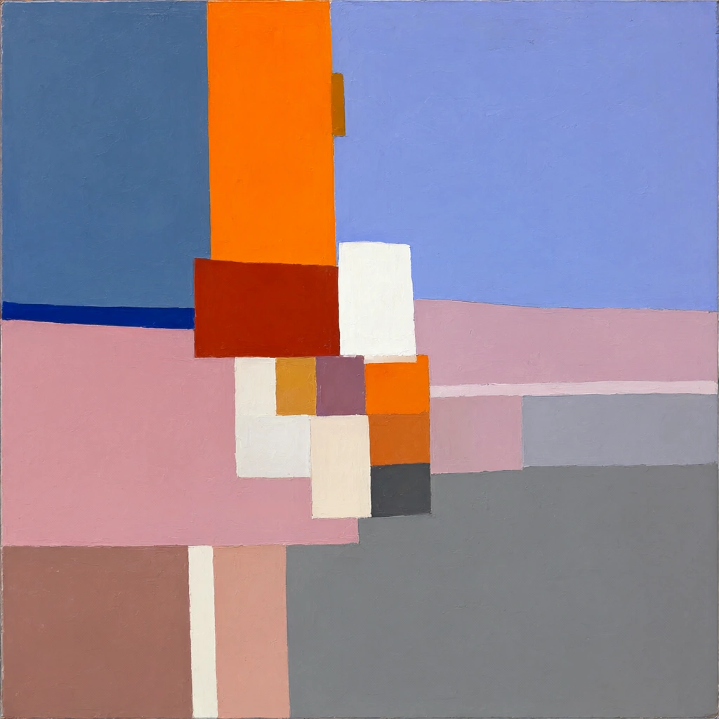 Qwen Image 2.1
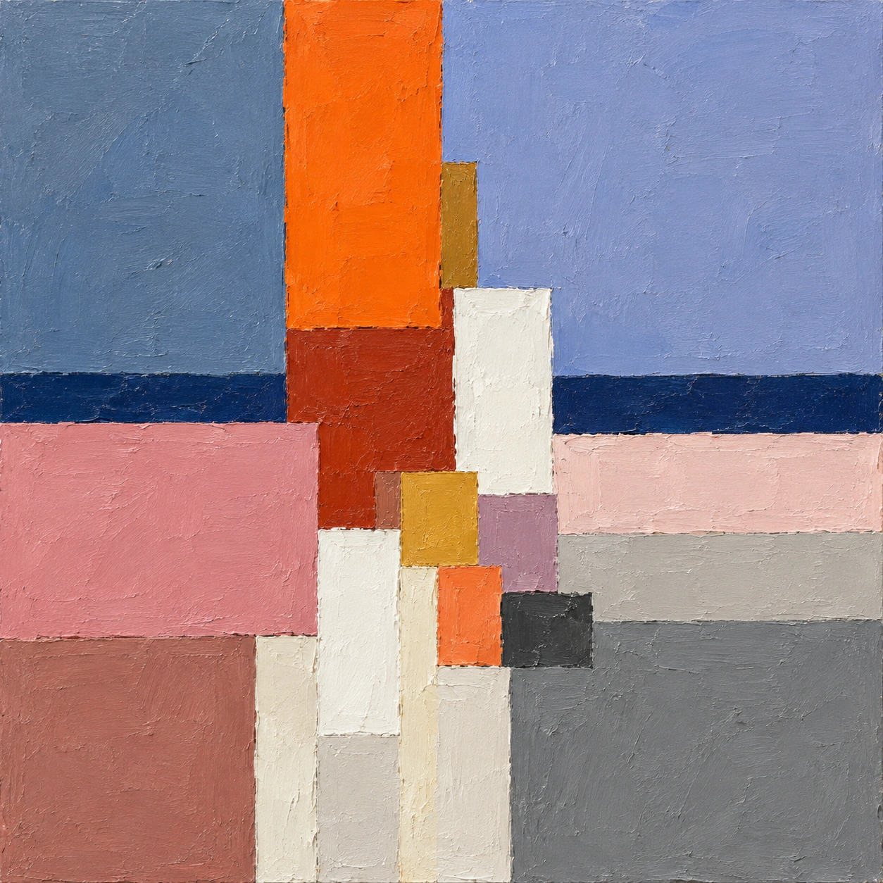 GPT Image 2.5
Reference details
- Reference ID
- 2018
- Category
- Painting
Reference prompts
Style prompt
Thick oil paint organizes the surface into broad, matte geometric areas whose boundaries remain slightly chipped and irregular. Cool slate and powder blue take up generous space, contrasted with a tall hot orange accent, dusty pink, warm gray, and concentrated off-white. Small dense color fragments collect around one focal zone, while wider uninterrupted planes give the cluster scale. Rectangular edges are largely vertical and horizontal, but visible scraping and uneven pigment prevent mechanical precision. Color value, overlap, and a narrow dark band establish shallow depth without cast shadows or conventional perspective. Illumination is even, letting warm-cool area relationships and subtle paint relief define the form. The overall treatment is balanced but not symmetrical, tactile yet restrained, with the largest chromatic accent offset by quiet cool masses.Full example prompt
The image is a square abstract oil painting of stacked orange, blue, pink, gray, and white color blocks with a narrow dark blue horizontal band. The upper background is divided into two large cool planes: muted slate blue on the left and a slightly lighter lavender-blue on the right. Rising from just left of center, a tall saturated orange rectangle reaches the top edge and narrows the space between those cool fields. Its painted sides are almost straight but visibly irregular, with a small darker ochre extension on its right at midheight. Beneath the orange, a deeper brick-red block steps downward and overlaps the pale lower structures. Across the middle, a thin deep blue strip runs horizontally from the left edge behind the central blocks toward the right. A broad dusty pink area fills the left lower middle, while lighter pink and warm gray strips continue across the right. Near the center, small white, cream, mustard, mauve, orange, and charcoal rectangles cluster tightly together, their irregular edges meeting and partly covering one another. One bright white vertical block rises above this cluster slightly right of center and catches the eye against the soft blue background. The lower left holds a muted rose-brown rectangle, interrupted by narrow off-white vertical passages. On the lower right, a broad medium gray plane extends to the edge, its matte surface darker than the pale central whites but lighter than the thin blue band. The entire surface carries thick, uneven pigment and faint scrape marks, especially where one block ends and another begins. Light appears flat and ambient, with no cast shadow or illusion of a single lamp; contrast arises from adjacent color values and the small rough ridges of paint. The arrangement suggests shallow overlapping planes without a fixed object or realistic space. The overall composition balances the tall warm orange accent and compact pale center against broad cool upper fields and a quiet gray lower mass.