
Styles
#2377
Barry Blitt style reference and prompts
Explore the “Barry Blitt” reference with fine linear detail, scratch-like marks, and negative space. View the images, copy the style or example prompt, and discover related styles on Looksift.
Compare the Qwen Image 2.1 and GPT Image 2.5 examples, choose the visual qualities you want, and copy the style prompt for your own project.
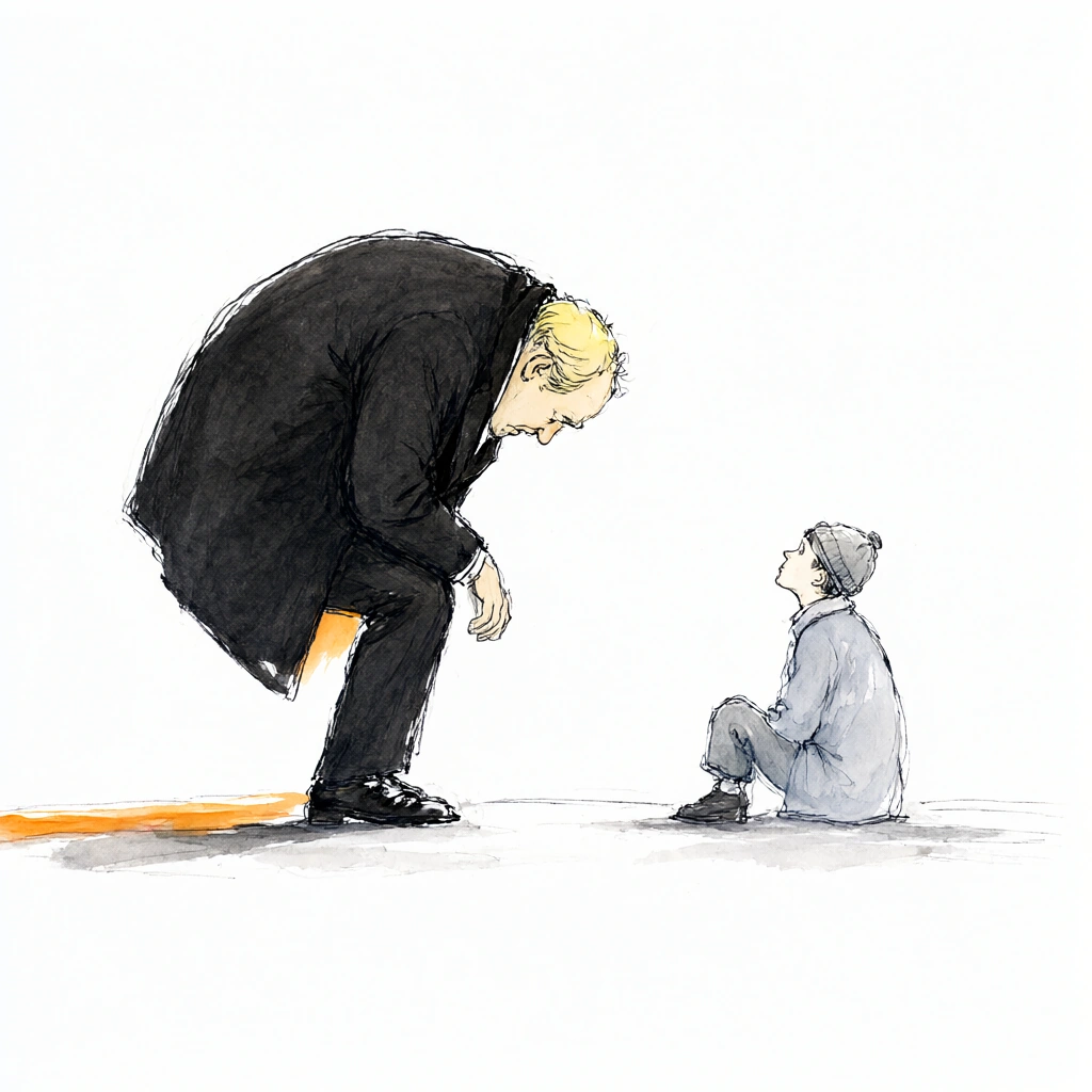 Qwen Image 2.1
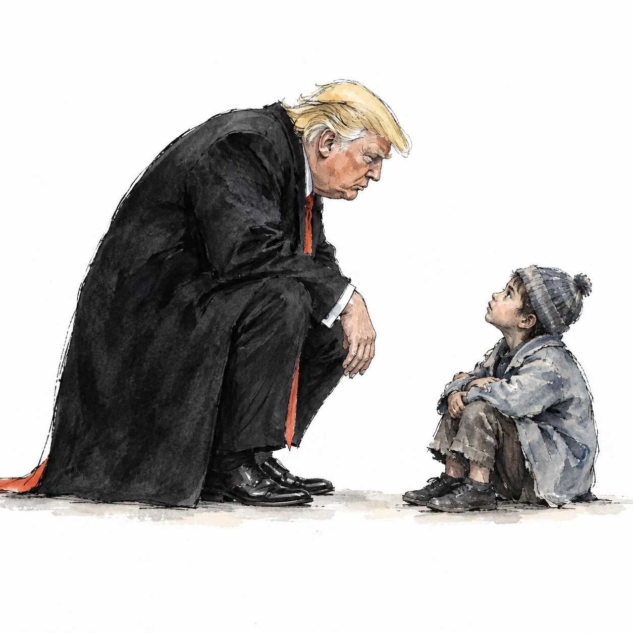 GPT Image 2.5
Reference details
- Reference ID
- 2377
- Category
- Painting
Reference prompts
Style prompt
Editorial watercolor cartooning leaves much of the paper white, placing loose ink contours and thin uneven washes only where they carry the idea. Broad charcoal masses contrast with small pale gray and muted warm accents. Scratchy fine lines sharpen expressive details, while soft watercolor edges and faint contact shadows keep the figures light on the page. Scale contrast and generous negative space do more work than background decoration. Light reads as clear and even, with the paper itself providing the brightest value. The overall treatment is economical, pointed, and gently satirical.Full example prompt
A square editorial watercolor cartoon places a large suited man and a much smaller seated figure in an otherwise white, nearly empty space. The older man occupies the left half, bending deeply at the knees and waist so his head approaches the level of the person opposite him. His pale yellow hair and lowered face are drawn with quick dark strokes, and a black overcoat spreads into a broad triangular mass from shoulders to the ground. One hand extends downward near his bent knee, while polished dark shoes touch the faint gray floor line. On the right, the smaller person wears a pale blue-gray coat, cropped trousers, dark shoes, and a small knit cap. The figure sits low with knees bent and head tilted up toward the larger man, creating an immediate exchange through posture rather than a detailed setting. A narrow warm orange strip peeks from beneath the big coat and trails along the ground at the far left. Light gray washes and a few beige marks make contact shadows beneath the feet and seated body, but most of the surrounding paper remains untouched white. The linework is loose, slightly scratchy, and concentrated around faces, hands, clothing edges, and shoes. Thin watercolor layers give the coat and cap uneven tones without filling every contour. Even studio-like light is implied by the bright paper and modest contact shadows; there is no dramatic directional shadow. The large difference in scale carries the image's visual tension, while the restrained color keeps attention on the confrontation. The overall composition is sparse and satirical, balancing a heavy dark wedge against a small pale form across broad negative space.