
Styles
#3137
Conrad Roset style reference and prompts
Explore the “Conrad Roset” reference with transparent washes, asymmetric composition, and pale neutral tones. View the images, copy the style or example prompt, and discover related styles on Looksift.
Compare the Qwen Image 2.1 and GPT Image 2.5 examples, choose the visual qualities you want, and copy the style prompt for your own project.
 Qwen Image 2.1
 GPT Image 2.5
Reference details
- Reference ID
- 3137
- Category
- Ink & line
Reference prompts
Style prompt
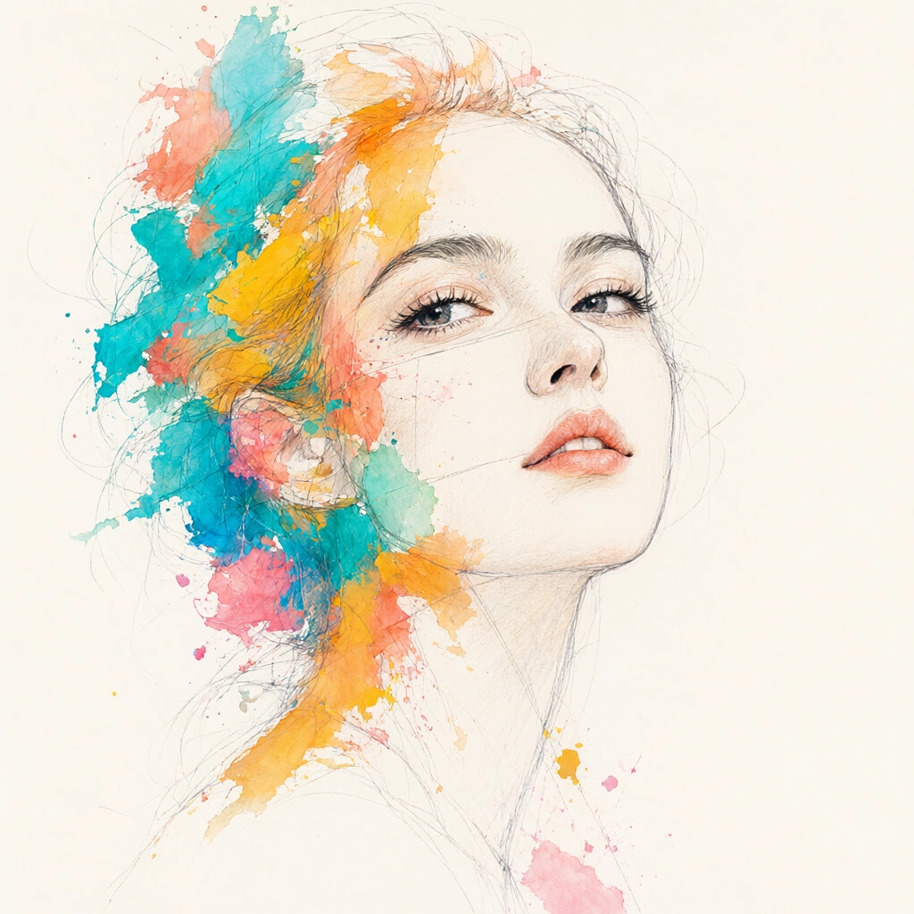
Delicate graphite-like contours sit on warm off-white paper, interrupted by translucent washes and opaque daubs of turquoise, apricot, golden yellow, and pink. The colored forms overlap as torn irregular islands, with a few soft wet edges and many abrupt broken ones. Thin exploratory lines run through them and continue into open space. Tiny splashes and round flecks disperse from the densest cluster, while a broad quiet area remains almost untouched. Even pale light leaves little cast shadow; contrast is carried by a handful of dark precise lines and saturated pigment against cream ground. The asymmetry feels lively yet controlled, joining careful observation to spontaneous painted interruption. The surface retains the appealing incompleteness of a worked sketch.Full example prompt
A close illustrative study places a woman's face across a warm off-white field. Her gaze turns slightly upward to the right; finely described lashes, brows, nose, and coral lips remain recognizably drawn, while the left side of the head dissolves into overlapping bursts of turquoise, apricot, golden yellow, and pink. Thin graphite-like construction lines cross the colored patches and extend beyond the face, giving the image the feeling of a sketch that has become unexpectedly vivid. Small splashes and dots scatter around the cheek and hair area, but the lower right remains spacious and quiet.

The surface mixes delicate pencil drawing with translucent washes and more opaque paint daubs. Fine grey line contours give the facial planes clarity without fully enclosing them. Color appears in torn, irregular islands: some edges are wet and soft, others sharply broken, with a few flecks thrown outward. The light is even and pale, with little cast shadow; contrast comes instead from dark lashes and the saturated color against cream paper. The composition is asymmetric, the face large and cropped, and the paint activity concentrated on one side. The result is intimate, lively, and slightly unfinished in a deliberate way, preserving both observational draftsmanship and spontaneous painterly interruption. No readable text or typography appears in the selected image.