
Styles
#3920
Katsushika Hokusai style reference and prompts
Explore the “Katsushika Hokusai” reference with hatching, paper texture, and pale neutral tones. View the images, copy the style or example prompt, and discover related styles on Looksift.
Compare the Qwen Image 2.1 and GPT Image 2.5 examples, choose the visual qualities you want, and copy the style prompt for your own project.
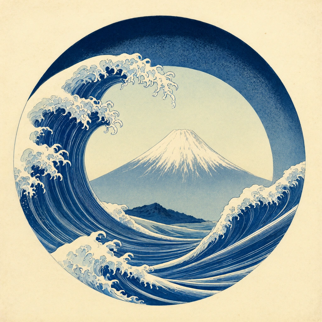 Qwen Image 2.1
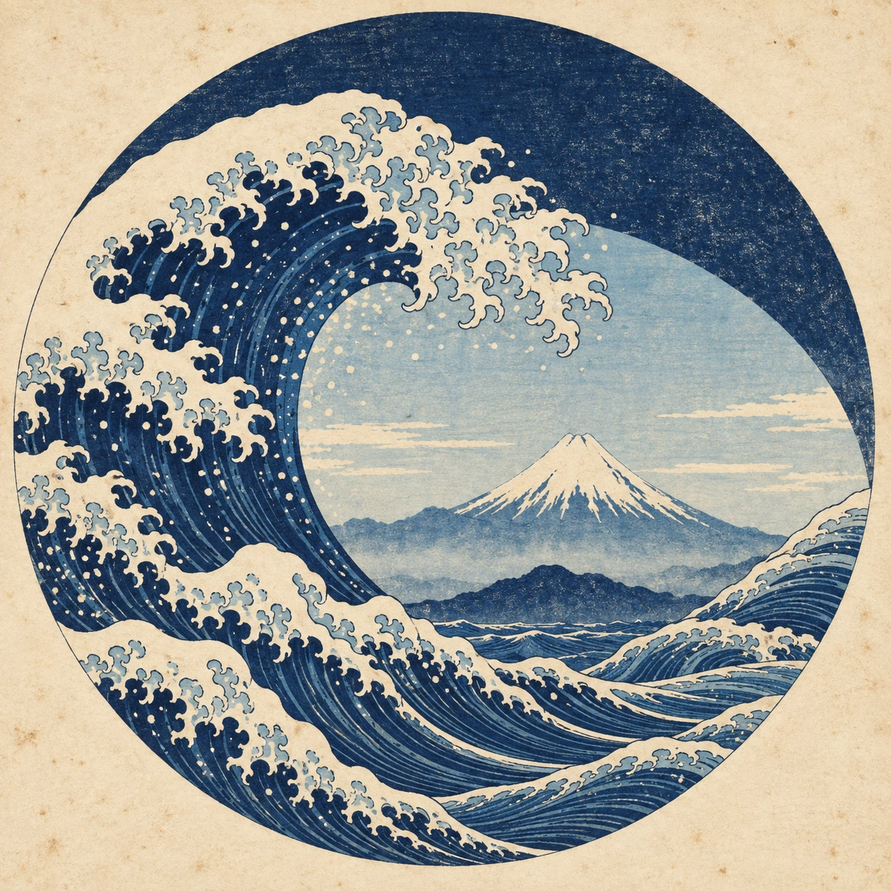 GPT Image 2.5
Reference details
- Reference ID
- 3920
- Category
- Ink & line
Reference prompts
Style prompt
Use Japanese woodblock-print construction with flat limited inks, strong contour lines, repeated parallel hatching, and visible paper grain. Balance deep indigo against faded blue and warm unprinted cream. Build motion through nested curves and finely broken foam-like edges, while a simple distant form remains calm inside the composition. Keep shading graphic rather than volumetric and allow slight pigment irregularity or age spotting. Use a bold enclosing shape and generous paper margin for a clear emblematic rhythm.Full example prompt
A square Japanese woodblock-style print places a circular blue seascape on warm cream paper. The circle occupies most of the frame but leaves broad bare margins at the corners. Along its lower-left edge, a tall indigo wave rises and curls inward, its crest breaking into many small cream claws of foam. Several narrower bands of water sweep around the bottom and right, carrying fine parallel lines that describe the current. In the open center, a pale snow-capped mountain stands under a light sky, its triangular peak centered slightly right and its lower slopes softened by atmospheric blue. A smaller dark ridge lies near the bottom of the circular opening. Above, a thick navy arc curves from upper left to upper right like a deep night sky or enclosing wave, with mottled ink grain in its blue field. The foamy crest crosses this arc and nearly touches the top of the inner opening, making the sea appear both powerful and carefully contained. The design uses flat printed color rather than modeled light: dark blue, faded blue, pale cream, and the unprinted paper create all depth. Fine contour lines and repeated wave striations remain crisp, while the paper shows faint age spots and uneven pigment. There are no people, boats, or written characters. The circular framing holds the restless waves against the stable mountain and broad paper border. The overall composition is rhythmic and balanced, combining forceful movement, precise linework, and calm distant space.