
Styles
#4103
Halftone print style reference and prompts
Explore the “Halftone print” reference with tactile surfaces and pale neutral tones. View the images, copy the style or example prompt, and discover related styles on Looksift.
Compare the Qwen Image 2.1 and GPT Image 2.5 examples, choose the visual qualities you want, and copy the style prompt for your own project.
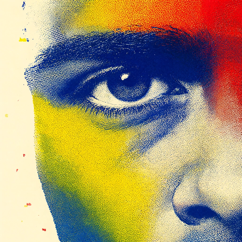 Qwen Image 2.1
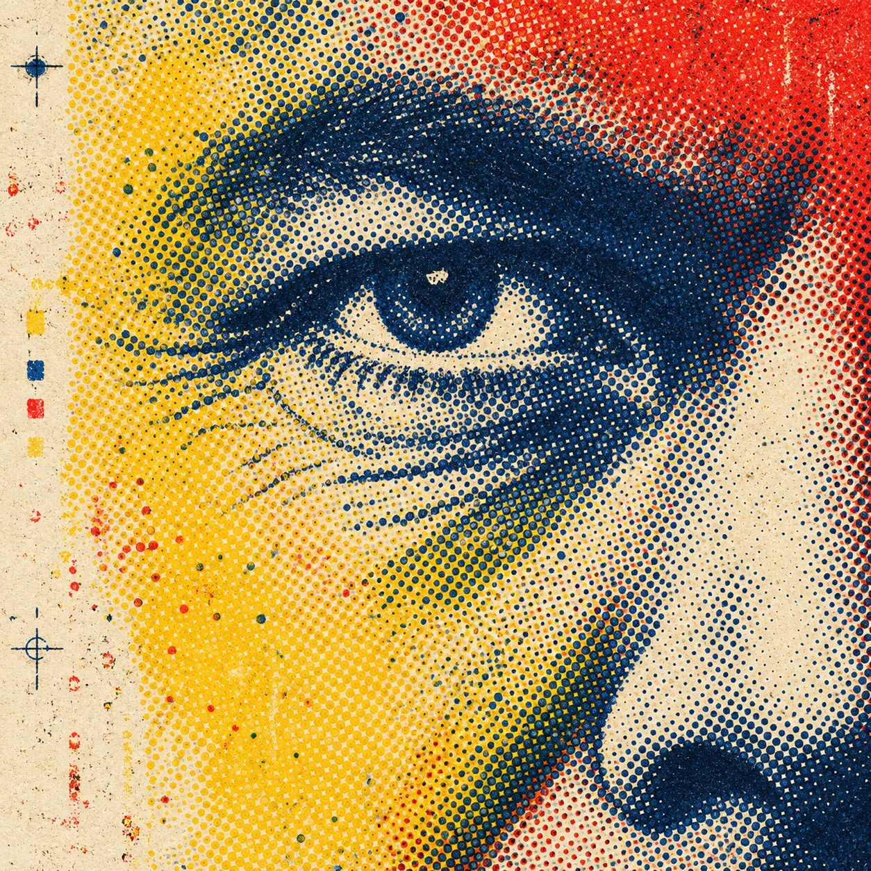 GPT Image 2.5
Reference details
- Reference ID
- 4103
- Category
- Flat illustration
Reference prompts
Style prompt
The image has an enlarged halftone-print surface where visible dot screens and imperfect color registration construct tonal form. Dense dots fuse into dark masses, then open into sparse speckle along lighter edges. Deep cyan-blue, sharp yellow, warm red, and cream occupy bold neighboring areas; overlaps create secondary dark or greenish passages without seamless gradients. Cropping is tight, making a small focal region and the printing structure equally prominent. Some edges are crisp screen boundaries, while others fray into broken dots and worn ink. Illumination is expressed through unprinted pale ground and changing dot density, with compact dark accents supplying depth. Broad blank areas counter saturated clusters and prevent the surface from becoming uniformly busy. The overall effect is raw, graphic, and immediate, with mechanical repetition made visibly tactile.Full example prompt
A square halftone-print image crops tightly into one human eye and the side of a nose, using overlapping blue, yellow, red, and cream dot fields. The eye sits just above the center, looking outward beneath a dense dark-blue brow. Fine wrinkles and skin folds radiate from its lower corner as clusters of blue marks that shift from solid ink to separate dots. A broad yellow plane crosses the left cheek and temple, while the upper right burns with a rough red field. At the far right, the nose enters as a bright cream curve carrying dense black-blue dots along its shadowed side. Much of the left margin remains warm off-white, interrupted by scattered registration marks and a few faint red and yellow flecks. The blue ink around the eye is so dense it almost becomes continuous tone, but its printed dot structure stays legible. Yellow and red screens overlap the blue in places, producing irregular greenish and dark mixtures without smooth blending. The crop cuts away the rest of the face, making the eye, brow, and nose fragments nearly abstract shapes. Surface wear and imperfect alignment give the printed color a slightly broken, tactile edge. The viewer is placed extremely close, so the dot matrix is as noticeable as the facial form. Light is indicated by the unprinted cream areas around the eye and nose, while densely inked blue areas form shadow; no physical lamp or cast shadow is shown. No readable words appear. The overall composition is assertive and graphic, balancing the sharply focused gaze with exposed print mechanics and large blocks of primary-like color.