
Styles
#1579
Karl Knaths style reference and prompts
Explore the “Karl Knaths” reference with dry-brush texture, tactile surfaces, and pale neutral tones. View the images, copy the style or example prompt, and discover related styles on Looksift.
Compare the Qwen Image 2.1 and GPT Image 2.5 examples, choose the visual qualities you want, and copy the style prompt for your own project.
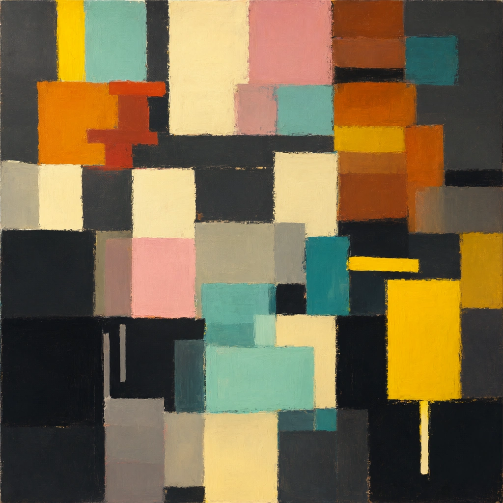 Qwen Image 2.1
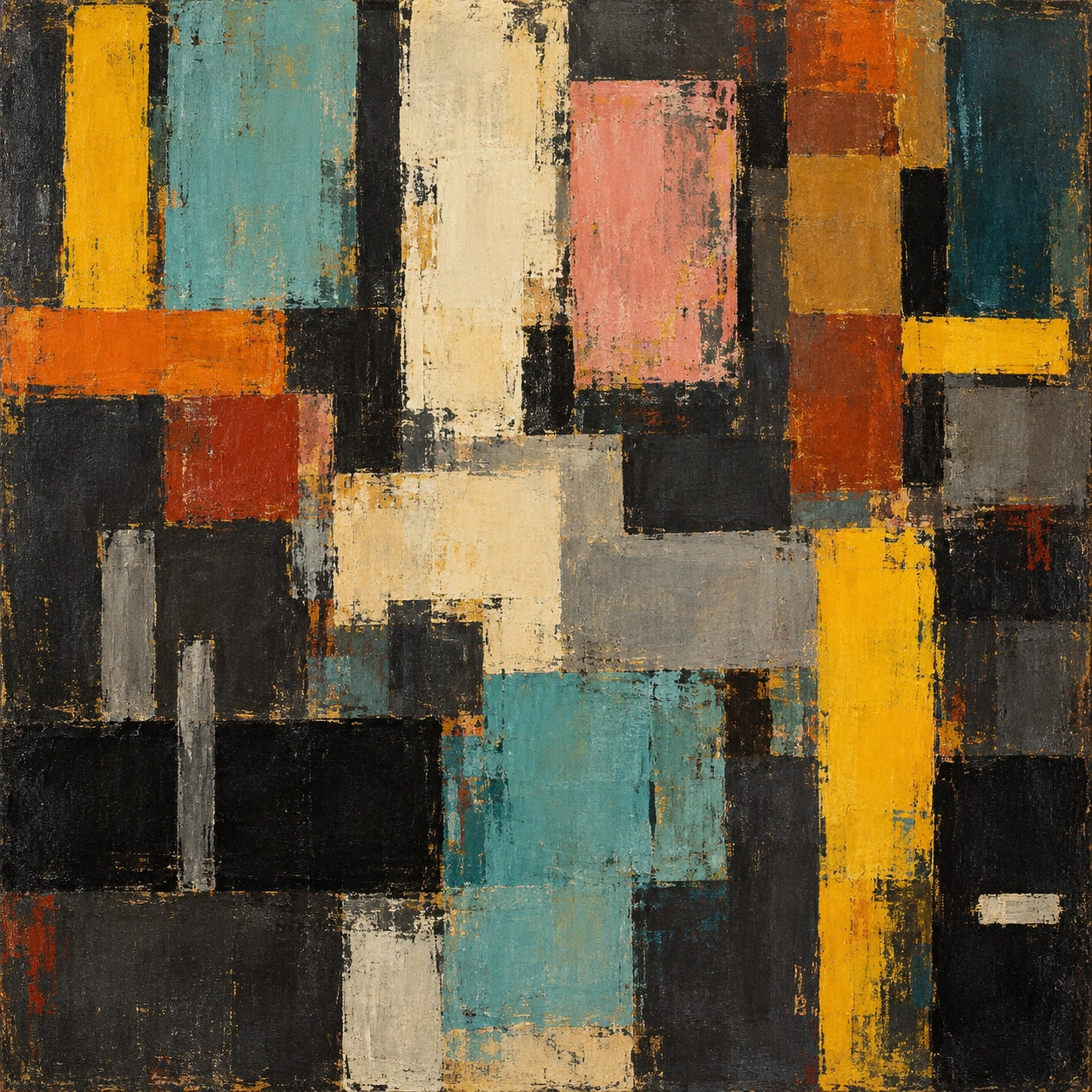 GPT Image 2.5
Reference details
- Reference ID
- 1579
- Category
- Painting
Reference prompts
Style prompt
The abstract painting organizes irregular rectangles and short bars into a compact, interlocking rhythm. Matte charcoal and umber grounds hold saturated ocher, burnt orange, dusty rose, cream, turquoise, and deep teal. Color is layered with variable opacity; rubbed edges, dry-brush drag, and small exposed underpaint prevent the geometry from becoming perfectly hard. Light emerges through value contrast between pale blocks and dark recesses rather than through a depicted source. Vertical runs are repeatedly interrupted by short lateral marks and offset steps. Grain and subtle scuffs keep the surface tactile at both large and small scales. The overall effect is measured but lively, with color placement and imperfect edges giving the flat field depth.Full example prompt
A square abstract painting fills the entire frame with interlocking color blocks, short bars, and worn edges. No figure, object, room, or horizon is identifiable. A large dark charcoal field provides the base, showing through gaps between the brighter shapes. Near the upper left, a narrow saturated yellow vertical block rises beside a broader dusty turquoise passage. A thick warm orange mark crosses them lower down and breaks into smaller red-brown patches. In the upper center, a tall cream shape stands beside a muted pink rectangle; their irregular painted margins reveal darker underlayers. Toward the right, stacked burnt-sienna, ocher, and deep teal patches form a dense column, interrupted by narrow black slots and a short bright yellow bar. The middle of the frame contains pale cream and gray pieces that step sideways rather than aligning in a strict grid. A broad black band cuts across the lower left, with small gray vertical marks rising through it. At the lower center, a translucent turquoise rectangle overlaps dark gray and cream areas, creating the clearest cool passage. On the lower right, a strong yellow vertical stroke drops into a near-black region with a small pale dash. Most shapes are roughly rectangular but not mechanically straight: brush drag, uneven opacity, and scraped borders make the edges slightly soft or broken. Thin layers of paint let earlier colors peek through, especially within the pink, ocher, and blue-green areas. The surface has a matte, rubbed, canvas-like grain rather than glossy finish. Light is intrinsic to the flat color relationships; the pale cream and yellow areas seem to glow because of adjacent deep charcoal, without a depicted physical source or cast shadow. The overall composition is densely balanced and quietly rhythmic, alternating upright colored blocks with short crossbars and dark recesses in a warm-cool exchange.