
Styles
#2794
Abraham Rattner style reference and prompts
Explore the “Abraham Rattner” reference with fine linear detail, layered surface texture, and cool blue-gray tones. View the images, copy the style or example prompt, and discover related styles on Looksift.
Compare the Qwen Image 2.1 and GPT Image 2.5 examples, choose the visual qualities you want, and copy the style prompt for your own project.
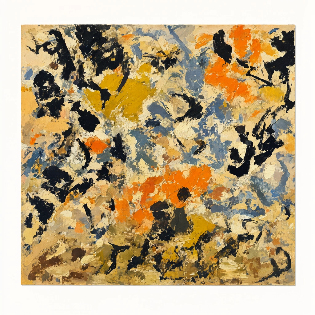 Qwen Image 2.1
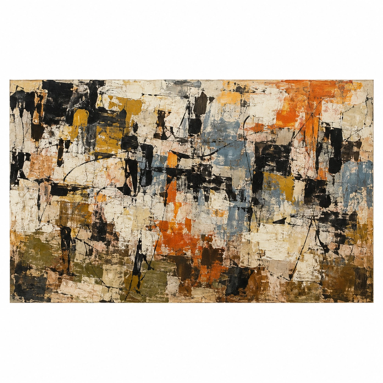 GPT Image 2.5
Reference details
- Reference ID
- 2794
- Category
- Painting
Reference prompts
Style prompt
Abstract painting accumulates opaque blocks, translucent rubbed layers, dry swipes, fine lines, and scraped interruptions on a warm pale ground. Black accents recur across the field, tying scattered mustard, burnt orange, blue-gray, cream, and muted olive together. Edges alternate between torn sharpness and worn softness; underpainting remains visible where later pigment thins. Dense clusters are separated by exposed pale gaps, so the surface stays active without becoming uniform noise. No pictorial light source is needed, because value contrast and pigment opacity establish the visual hierarchy. A long horizontal rhythm of small and medium marks keeps attention moving through the layered texture.Full example prompt
A square presentation of a horizontal abstract painting shows a densely layered field of broken black, ocher, orange, blue-gray, and cream marks on a warm pale ground. The actual painted rectangle sits centrally within a clean white margin, its long horizontal edges clearly visible. Inside the rectangle, there is no single figure or architectural subject. Irregular dark marks cluster at the upper left and across the middle, some like short heavy calligraphic strokes and others like torn silhouettes. Mustard yellow and burnt orange occupy small patches between them, with a stronger orange run near the upper right and another warmer cluster near the lower center. Blue-gray strokes interrupt the warmth at the center and right, while pale cream and off-white gaps thread throughout the composition. The surface appears scraped, overpainted, and reworked. Thin black lines, broad dry swipes, small opaque blocks, and translucent rubbed areas overlap at different depths. Some underlayers remain visible through later marks, creating an uneven patchwork rather than a flat mosaic. The lower band is slightly earthier, with tan, olive, and dark brown fragments gathered close to the bottom edge. Dark marks recur across the full width but never form a continuous border; the eye is kept moving through alternating dense and open passages. Light is even across the presentation, so contrast is created by pigment value and texture rather than a depicted light source. The surrounding white margin separates the art from the page and emphasizes the rough, active interior. The composition feels improvisational yet balanced: black accents pull the scattered colors together, while exposed pale areas keep the dense painted field breathable. Its energy lies in layered material, interrupted contours, and the rhythm of marks across a long rectangle.