
Styles
#4096
Monotype print style reference and prompts
Explore the “Monotype print” reference with tactile surfaces and simplified forms. View the images, copy the style or example prompt, and discover related styles on Looksift.
Compare the Qwen Image 2.1 and GPT Image 2.5 examples, choose the visual qualities you want, and copy the style prompt for your own project.
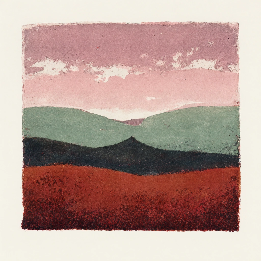 Qwen Image 2.1
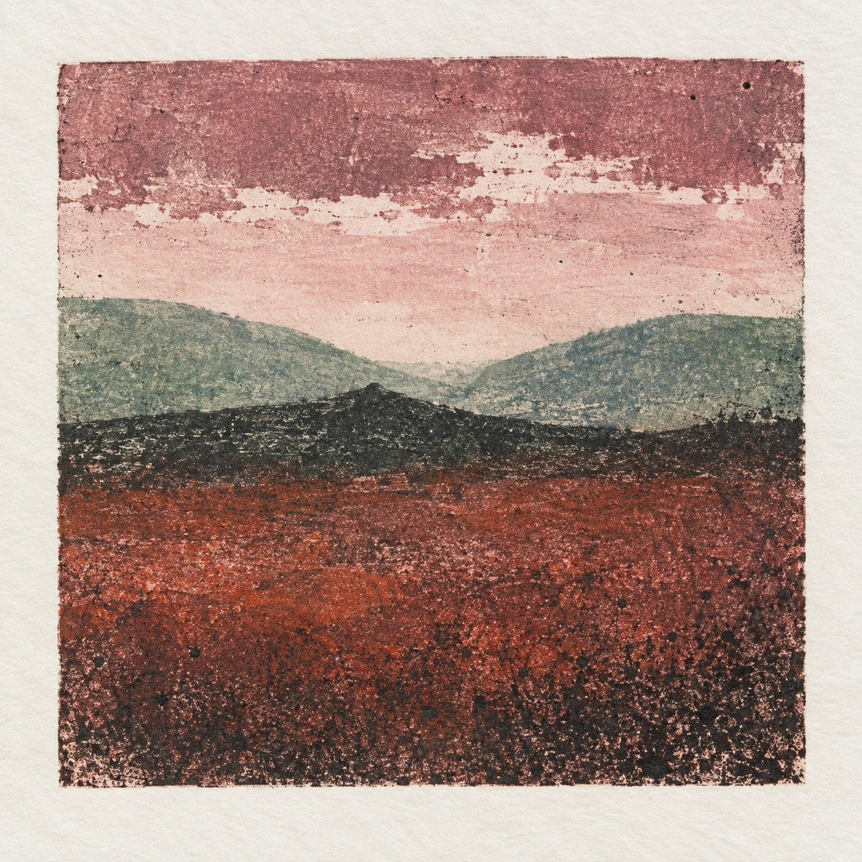 GPT Image 2.5
Reference details
- Reference ID
- 4096
- Category
- Ink & line
Reference prompts
Style prompt
The image has a monotype-print surface marked by imperfect ink transfer and visibly worked color bands. Soft horizontal areas overlap through rubbed transitions, broken edges, pinholes, and granular speckle rather than clean digital blending. Muted rose, mauve, dark blue-green, charcoal, and rust red meet in broad masses, with pale paper showing through selected gaps. The edges of the printed field are slightly irregular, and generous unprinted margin gives the textured center room to breathe. Light is conveyed by relative ink density and an opening of paler color, while darker layers weigh down the lower portion. Spatial depth stays shallow and atmospheric, built from successive color fields rather than detailed outlines. The overall effect is restrained, handmade, and quietly moody, with material variation carrying as much meaning as the simple shapes.Full example prompt
A square view of a small monotype landscape shows a roughly rectangular printed image centered on a broad off-white paper margin. Within the print, the upper band is dusty rose and mauve, its lower edge broken by irregular pale patches that let the paper-like ground show through. Below it, a softly pink middle sky opens above two muted green-blue hills that slope down toward a shallow central valley. A darker, almost black ridge crosses the middle foreground from left to right, with a small pointed rise near the center. The lowest portion is a wide rust-red and deep maroon field, grainy and uneven in its ink coverage. Dark speckling becomes denser toward the bottom edge and at the right, while warmer red pigment shows through the gaps. The printed rectangle has slightly wavering boundaries; its top and side edges are straighter than the rough meeting lines between color bands. No buildings, figures, plants, or readable writing interrupt the simple landforms. The image feels made by transferring ink from a worked plate: rubbed areas, pinholes, and accidental flecks remain visible in every layer rather than being retouched into smooth gradients. The pale paper border isolates the colored impression and makes its modest scale evident. Light is implied pictorially through the lighter pink opening in the middle distance and the pale green upper slopes; the foreground remains darker and heavier, without a cast shadow from any real object in the depicted view. The overall composition is spare and tactile, stacking soft horizontal land shapes beneath a rough rose sky while letting imperfect print transfer supply much of the visual interest.