
Styles
#4098
Lithography print style reference and prompts
Explore the “Lithography print” reference with scumbled paint, exposed paper, and variable-weight contours. View the images, copy the style or example prompt, and discover related styles on Looksift.
Compare the Qwen Image 2.1 and GPT Image 2.5 examples, choose the visual qualities you want, and copy the style prompt for your own project.
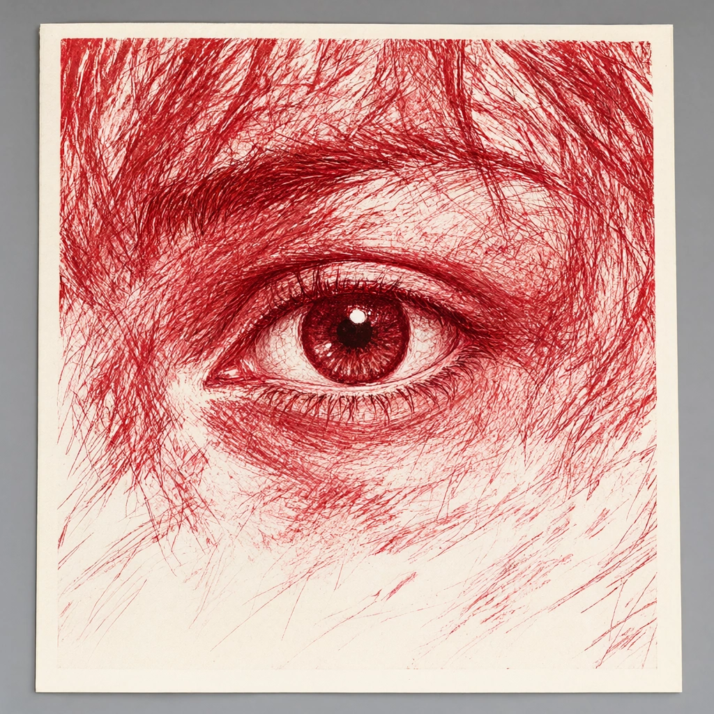 Qwen Image 2.1
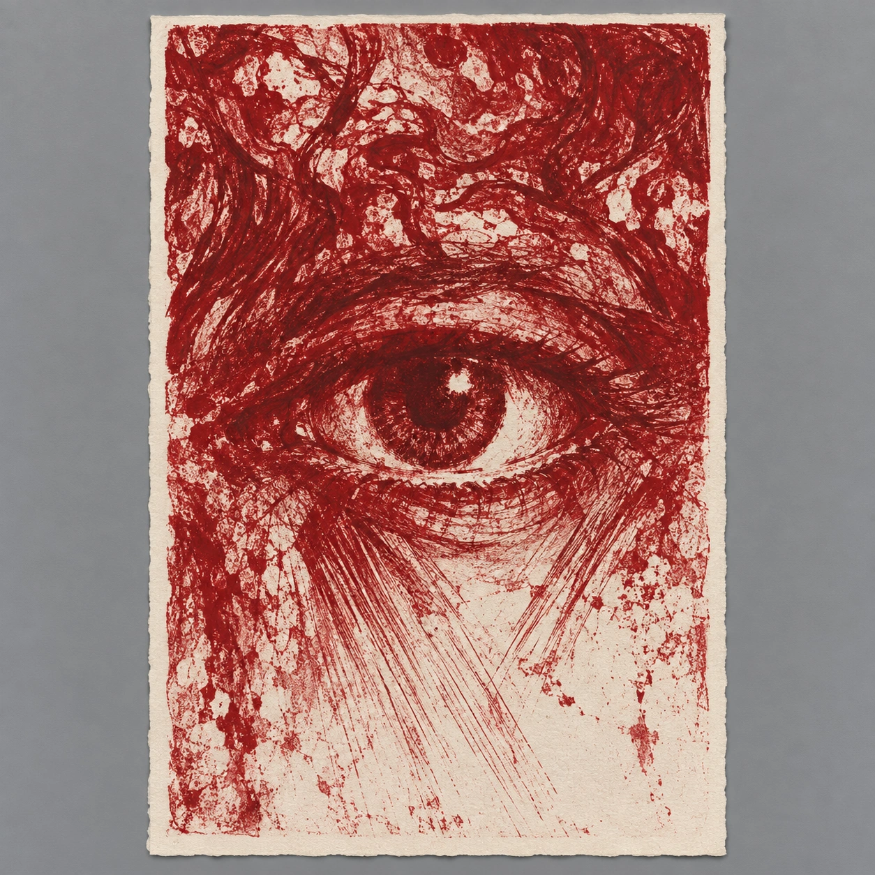 GPT Image 2.5
Reference details
- Reference ID
- 4098
- Category
- Ink & line
Reference prompts
Style prompt
Lithographic printmaking combines variable-pressure red marks with absorbent cream paper and a narrow irregular border. Broad scumbled patches, fine diagonal hatching, curved strokes, and ragged untouched gaps create a restless shift between density and openness. Crimson deepens to wine red in compressed areas and thins toward dusty rose where ink is sparse. Frontal graphic illumination comes from exposed paper, while shadow appears as accumulated mark weight. A compact dark circular focus holds the center as surrounding lines radiate and fragment outward. The result is raw, energetic, and visibly printed rather than smoothly rendered.Full example prompt
A vertical red lithographic print displayed within a square reference image shows a single enlarged human eye surrounded by restless marks. The printed sheet has a narrow uneven cream border and lies against a neutral gray background. The eye sits near the center, its dark iris and bright inner highlight enclosed by heavy upper and lower lids. Around it, red strokes spread into rough curves, radiating hatches, broken patches, and pale paper gaps. The upper third is especially dense, with twisting marks that suggest hair or an abstract canopy without settling into a fully separate scene. Below the eye, fine diagonal lines extend toward the lower edge, where the marks thin and more of the sheet remains visible. The red is not a single solid tone: varied pressure creates deep crimson, softer rose, and nearly white interruptions across the image. The surface reads as printed ink absorbed into textured paper, with ragged mark edges and slight grain. Light is graphic and frontal, carried by the untouched paper that brightens the lower region and the inner eye; shadows are dark red line clusters rather than naturally cast forms. The close crop gives the gaze an uneasy intensity despite the limited color. No lettering can be read. The overall composition pulls attention into one dark circular focus while the surrounding red marks expand outward across the tall sheet.